CODEFLOW WEBSITE CASE STUDY

website for SaaS code editor platform empowering developers with a reliable, community-driven code editor that combines seamless functionality with a bold, trustworthy design.

Walk through the case study with me

Walk through the case study with me

Walk through the process with me

Project Summary
A brand new outlook designed from scratch for Codeflow’s software as a service code editor platform. The project lasted about three weeks spanning the time between research, design and development.
Codeflow redefines the coding experience with a sleek, reliable, and community-driven code editor tailored for developers to build with confidence. The project’s success was driven by a focus on intuitive design, seamless user experience, and robust functionality.
Roles
Designer
No-Code developer
Tools
Figma
Framer
Adobe Photoshop
Problems codeflow was looking to solve
Lack of an Online Presence
No Clear Way to Communicate Brand Identity
Difficulty Educating Users About the Product
Limited Trust and Credibility
Challenges Attracting Early Adopters
Lack of a Scalable Platform for Future Growth
Missed Opportunities to Foster Community Engagement
Goal and objectives of the project
Highlight Key Features of the codeflow editor tool
Create an optimize website for Mobile and Desktop
Prepare their brand for future Scalability
Incorporate Strategic CTAs
Leverage Visual Storytelling
Encourage Community Engagemen
Enhance Discoverability
My process (Tested and trusted)
A sneak peak into what my screen looks like during ideation and design (in Figma), and development (In framer). Home screen development in framer, features section design in Figma, making home page responsive across all screens, About us page development in Framer.
Research and Analysis

Understanding client brief

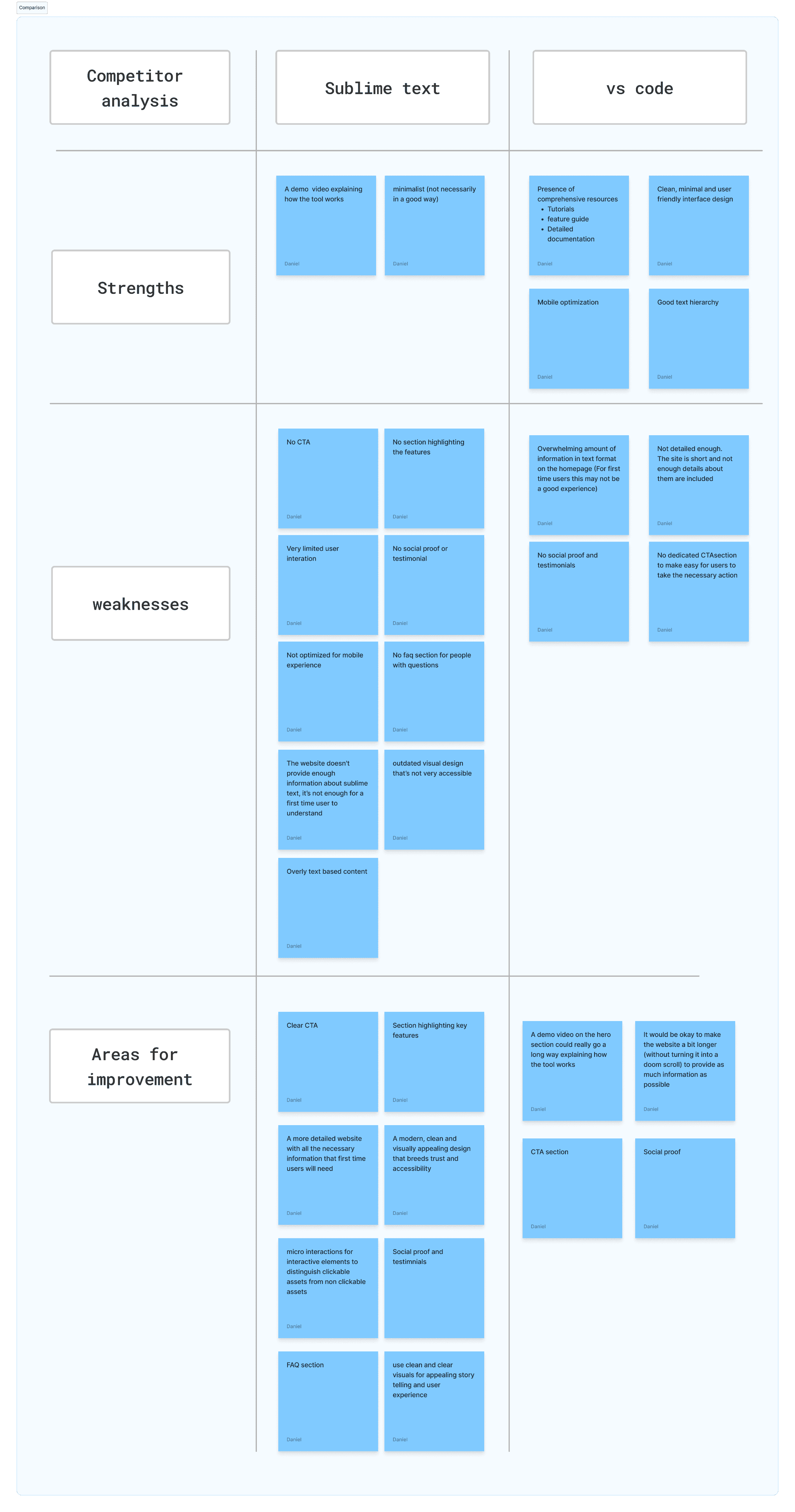
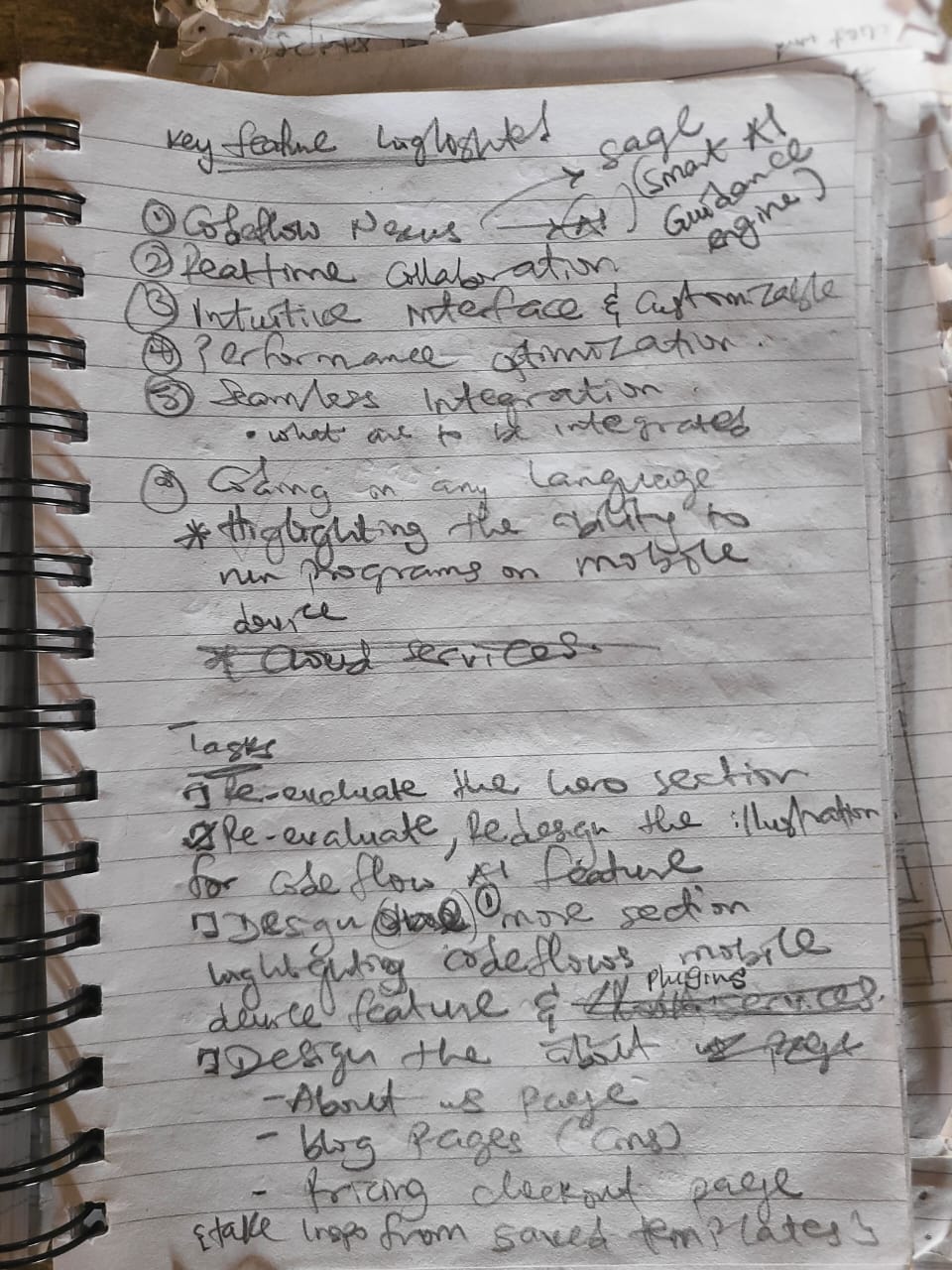
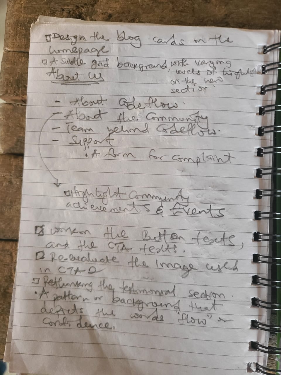
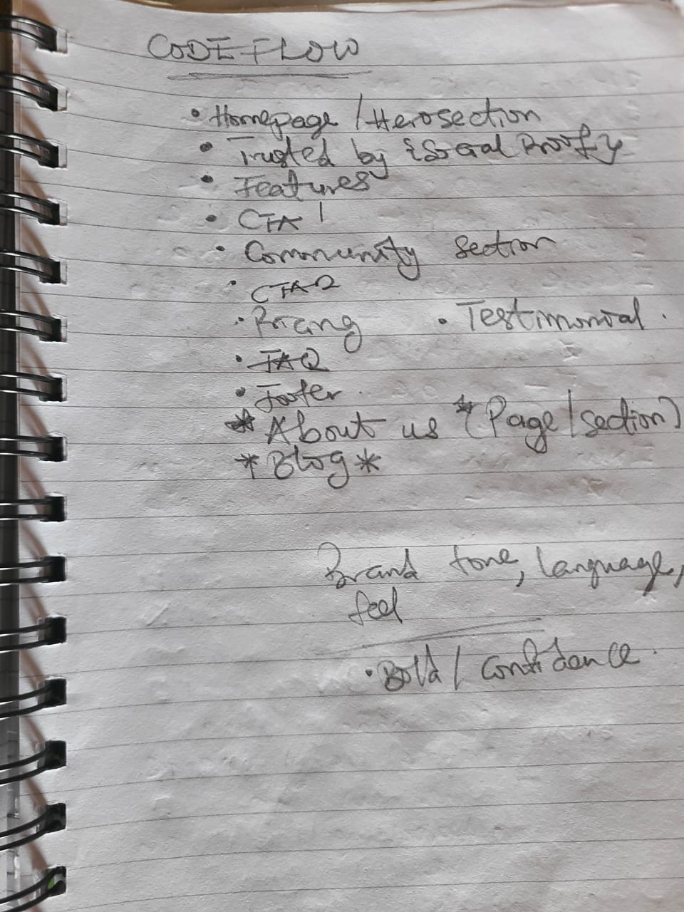
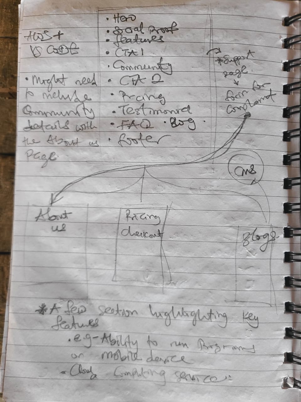
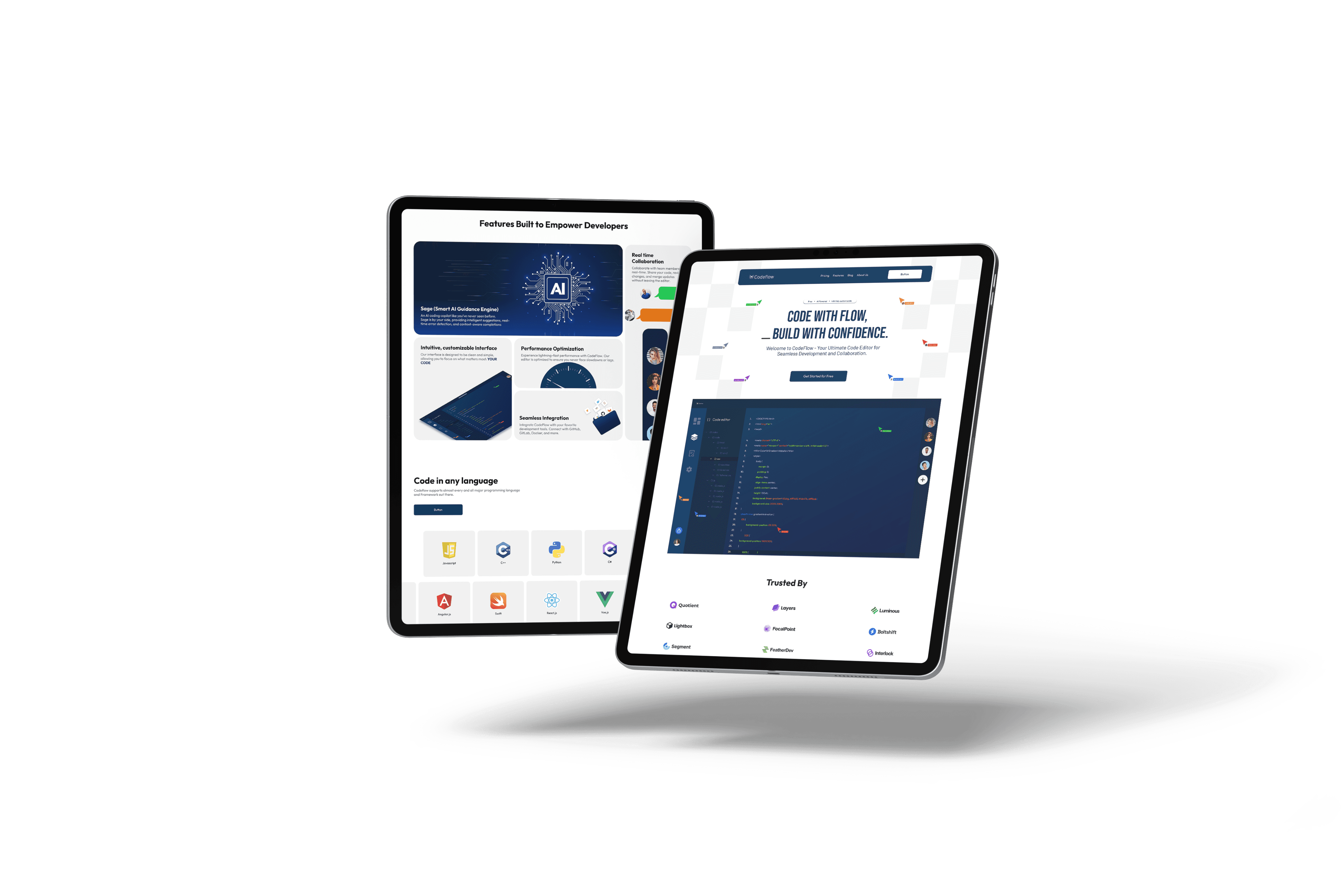
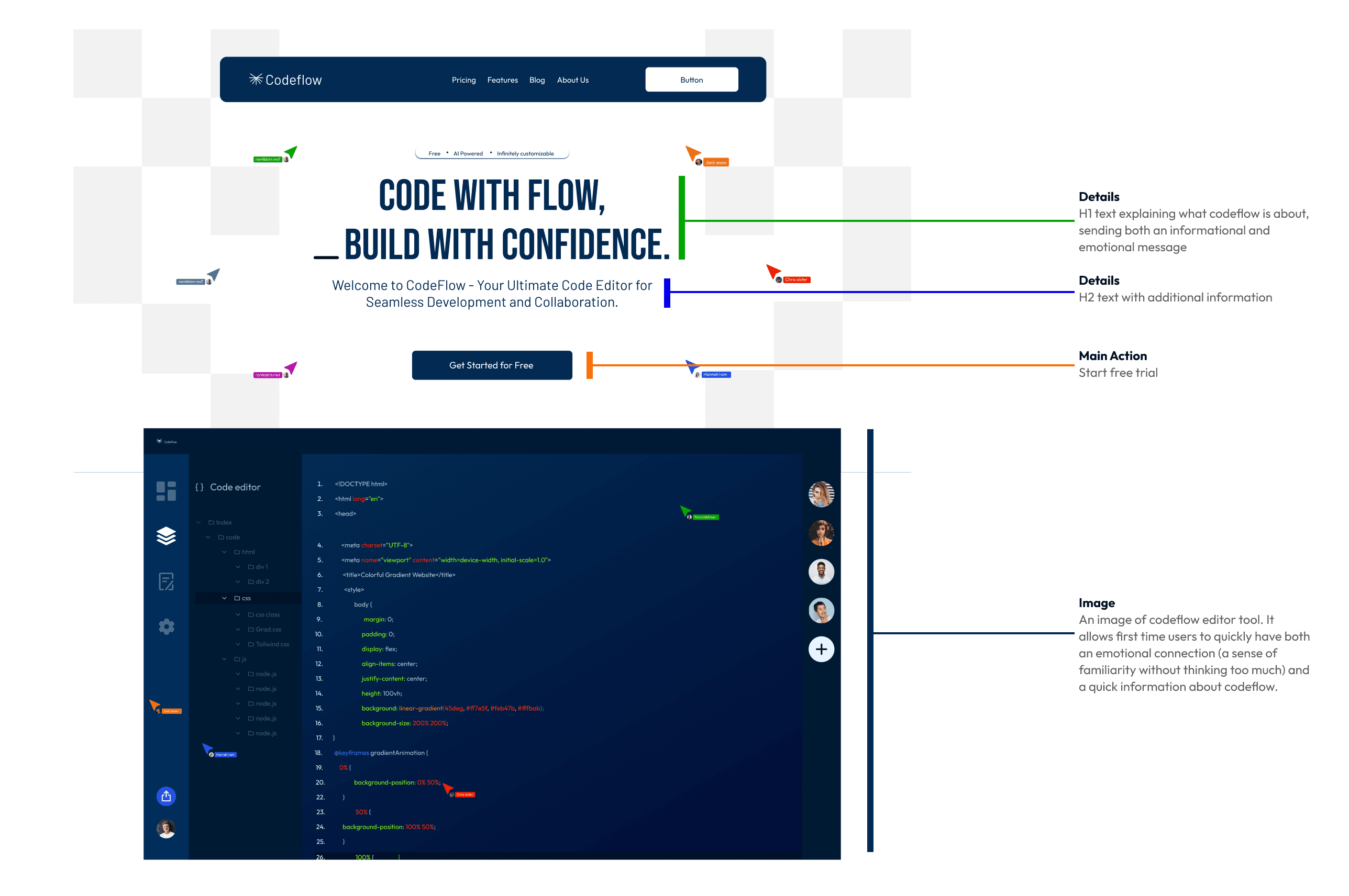
UX competitor analysis (competitors don't stand a chance)

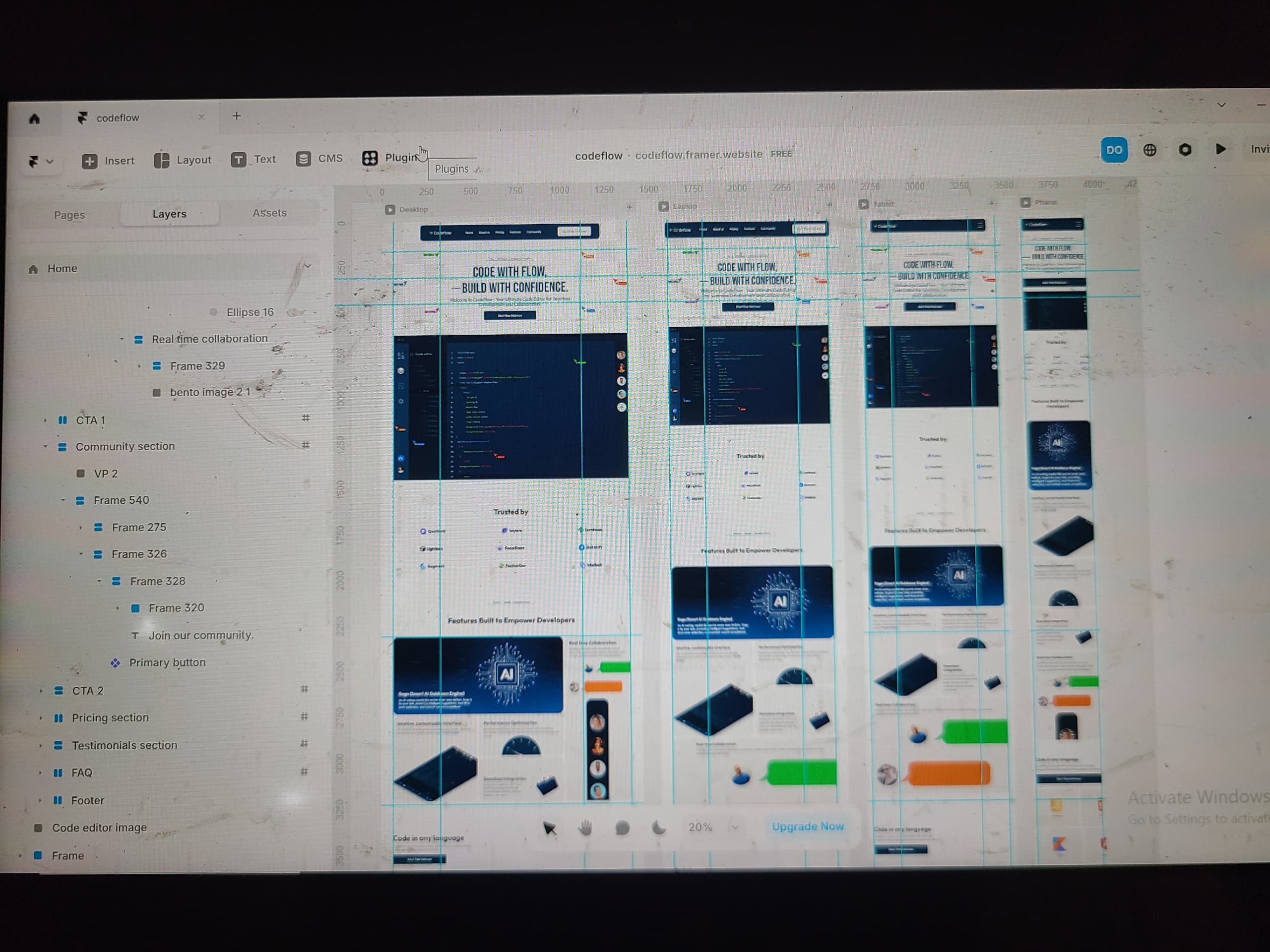
During the competitor analysis I made a list of Codeflow's top competitor's, carried out some annotations and analysis, and then highlighted their strengths, weaknesses and areas of improvement.

Moodboard (Inspiration gallery, ultimate search)

This gallery is what I came up with when I went on an internet ultimate search for inspiration. Finding parts, bits and pieces that could bring the perfect layout for every section and ultimately lead to better design.
Ideation and strategy (A lot of paper work done here)
Yes, I still rely on good old pencil and paper to come up with ideas. Detaching myself from my PC screen allows my mind to travel and just pour out an endless pool of ideas that I can then iterate on.

Every page has a neighbor

The entire map of how each section is collected under a page and how each page connects to other pages.

Every pixel moved with intention and purpose

H1 text hooks the users, the H2 text answers the basic question of what Codeflow is about, then a button with a clear call-to-action. The image takes the guess work out of the design for the user.
The research process shines here, the most important part of the testimonial is designed in bold text to capture the user's attention and to ensure that the most important information is scannable. The readable text in lower hierarchy provides more information.
Clean, aesthetically pleasing and data driven web design.
The research and ideation process all comes together to produce a clean, aesthetically pleasing and data driven website design. It adheres to all the important principles of a good website.

© Copyright 2023. All rights Reserved.

© Copyright 2023. All rights Reserved.

© Copyright 2023. All rights Reserved.