Vibrantpulse website case study
Website design for a cutting-edge digital marketing agency creating impactful online presences for businesses.
Project Summary
The complete overhaul of the Vibrant Pulse website focused on refreshing the visual design, enhancing user experience, and strengthening the brand’s online presence.
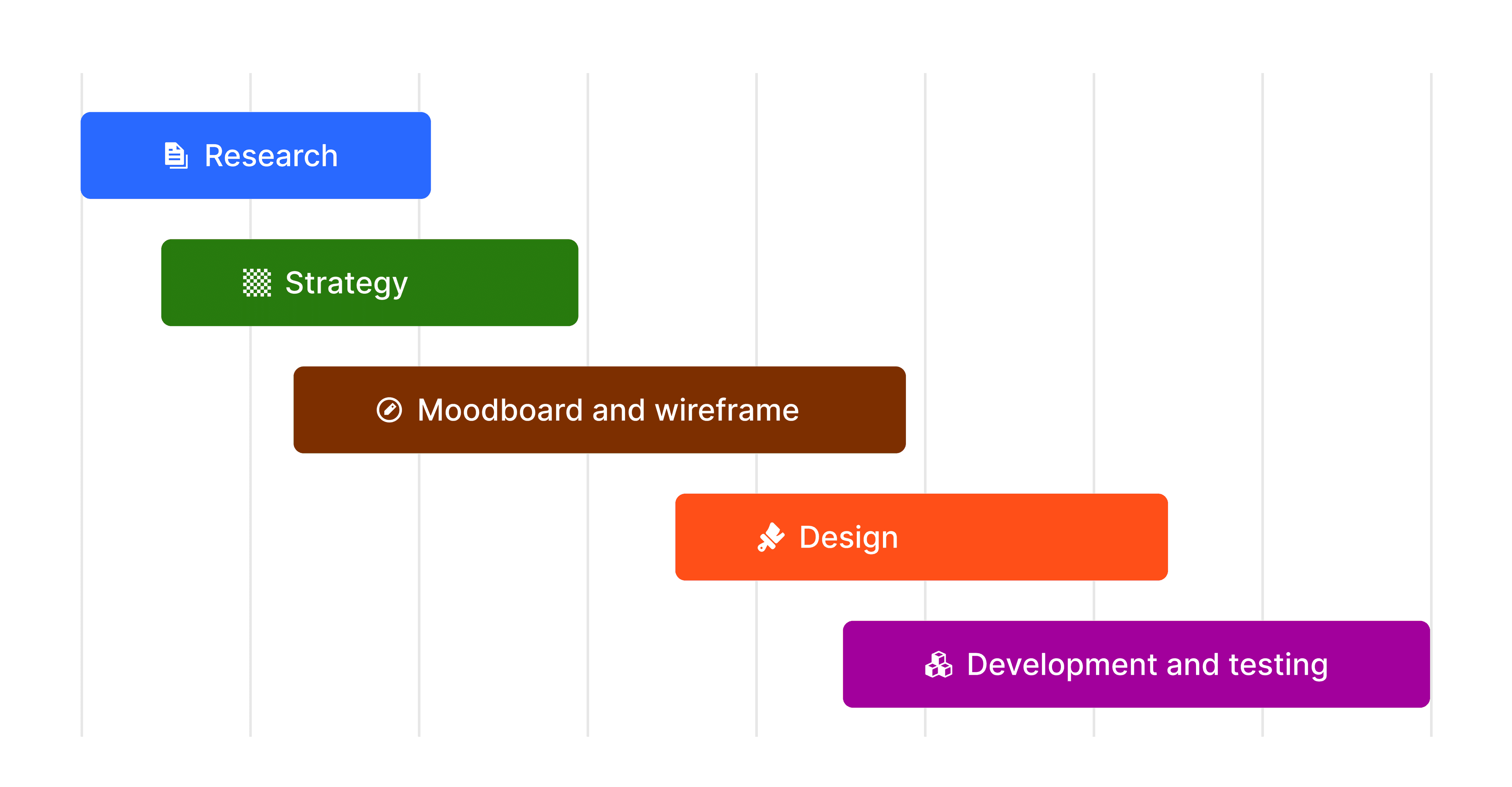
The project lasted about 4 weeks spanning the time between research, design, and development. The design went through multiple iterations to arrive at the final product.
Roles
Designer
No-Code developer
Tools
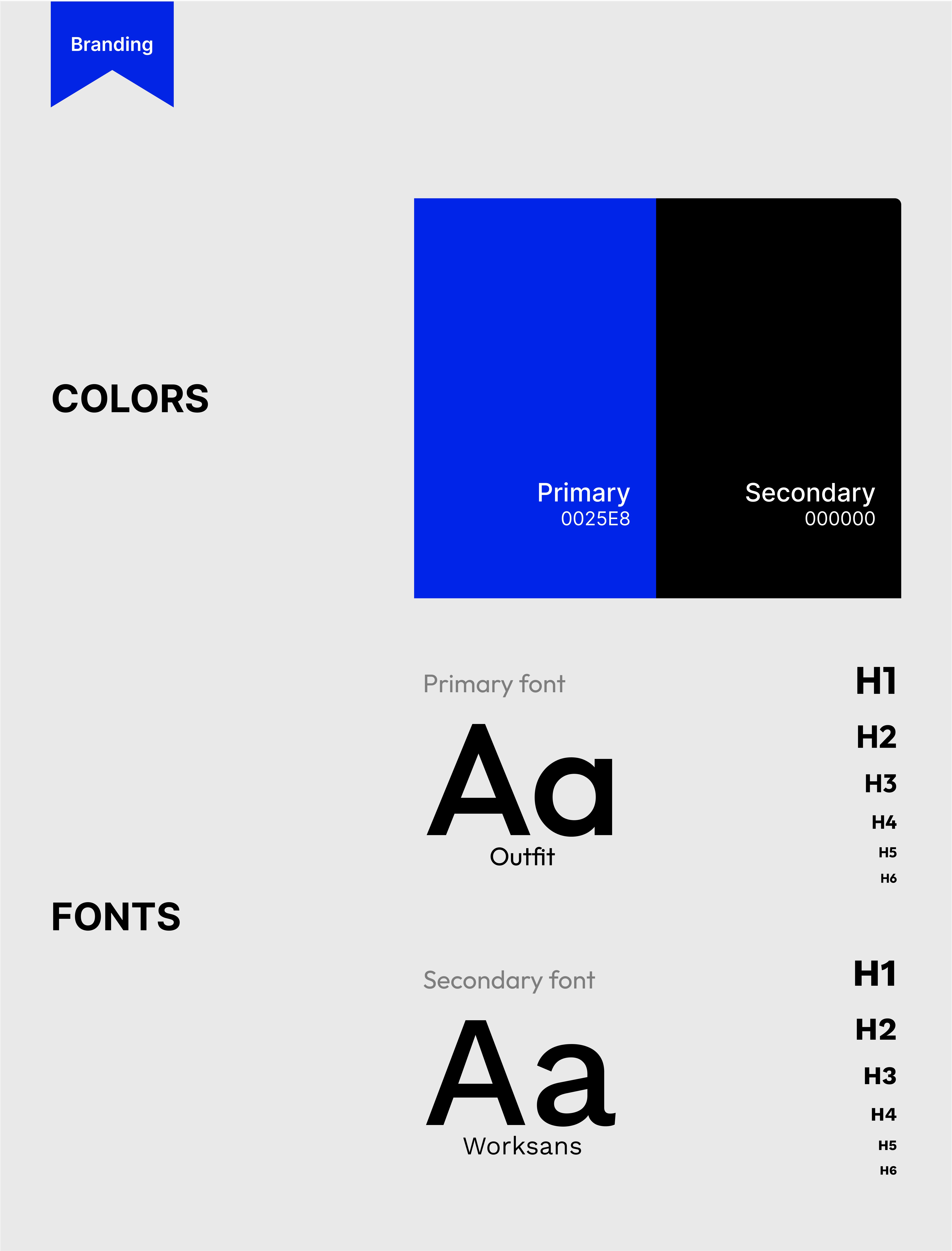
Figma
Framer
Adobe Photoshop
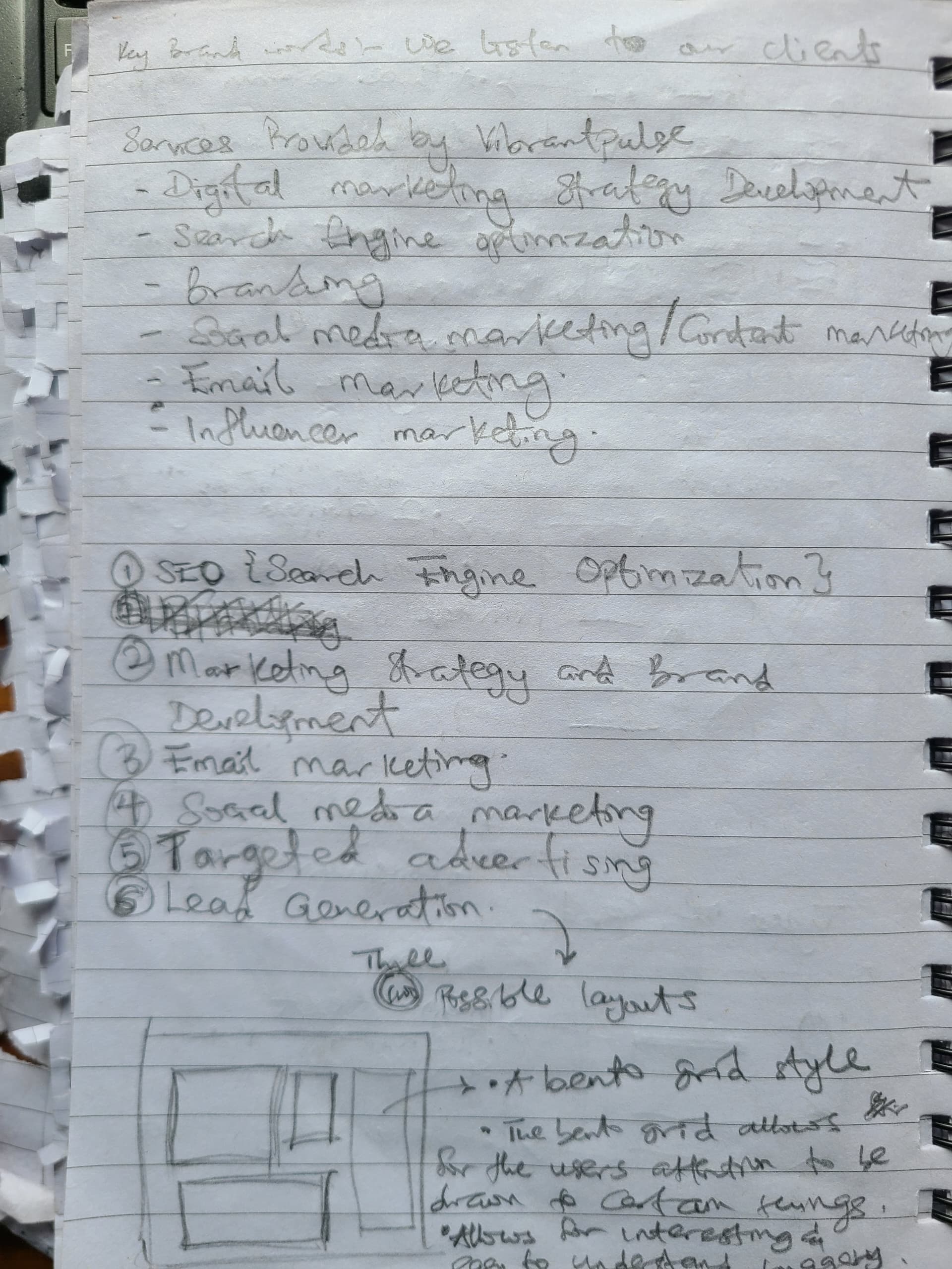
Problems vibrantpulse was looking to solve.
Outdated Aesthetics and User Interface Design
Underutilized Brand Story and Emotional Connection
Limited Showcase of Expertise and Case Studies
Low Engagement and Missed Opportunities for Client Interaction
Inefficient Mobile Experience and Site Performance

Goal and objectives of the project
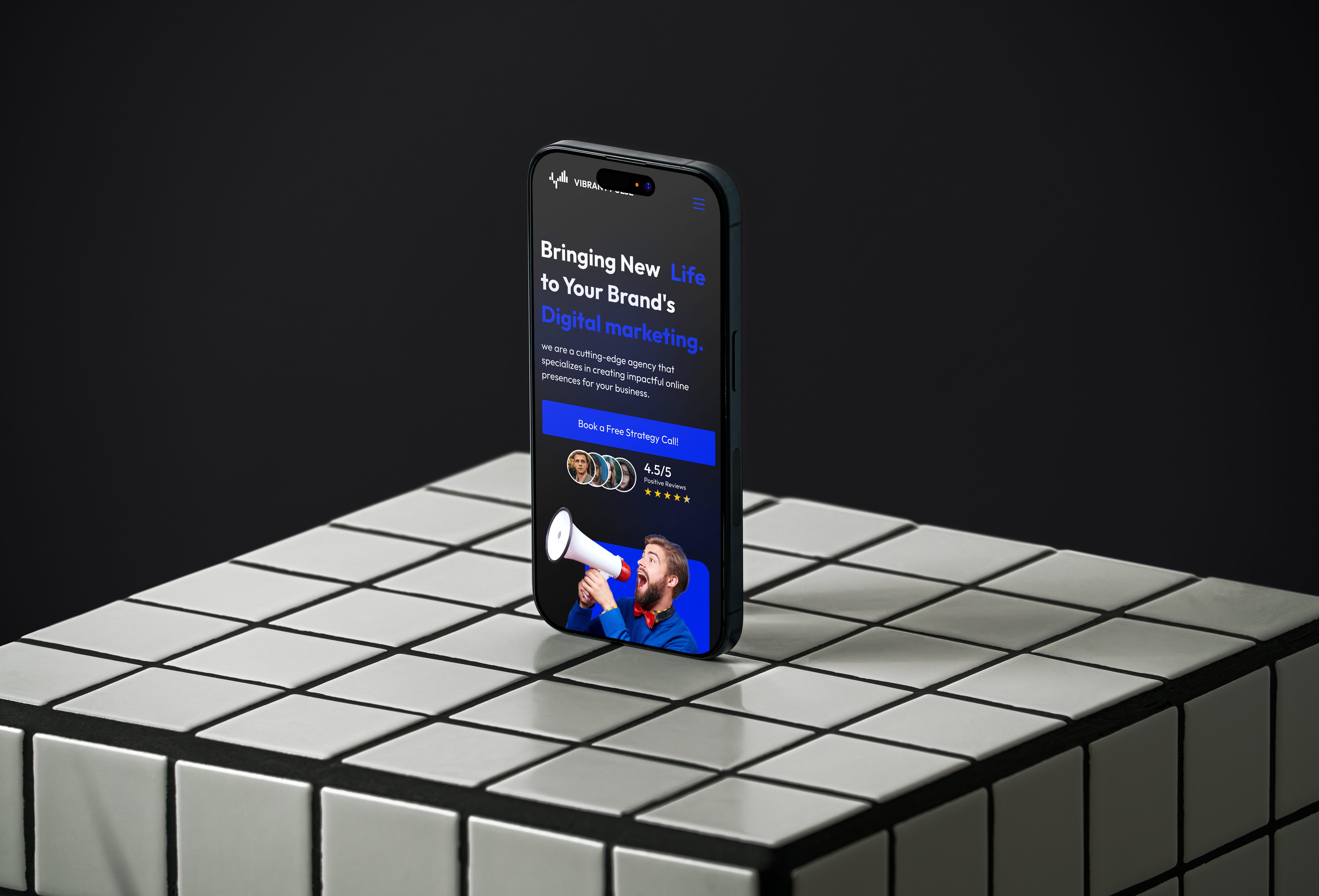
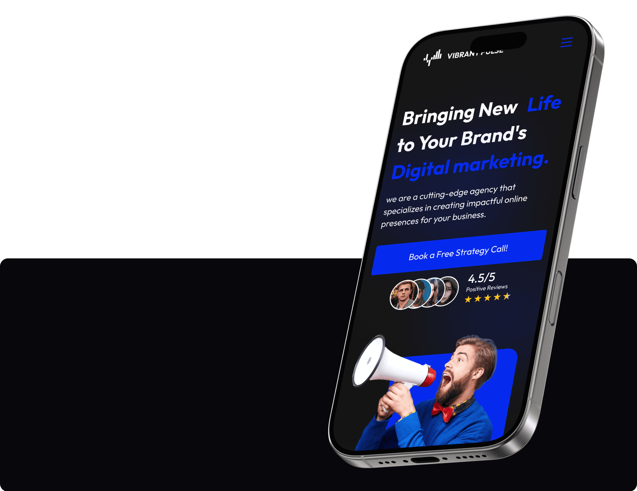
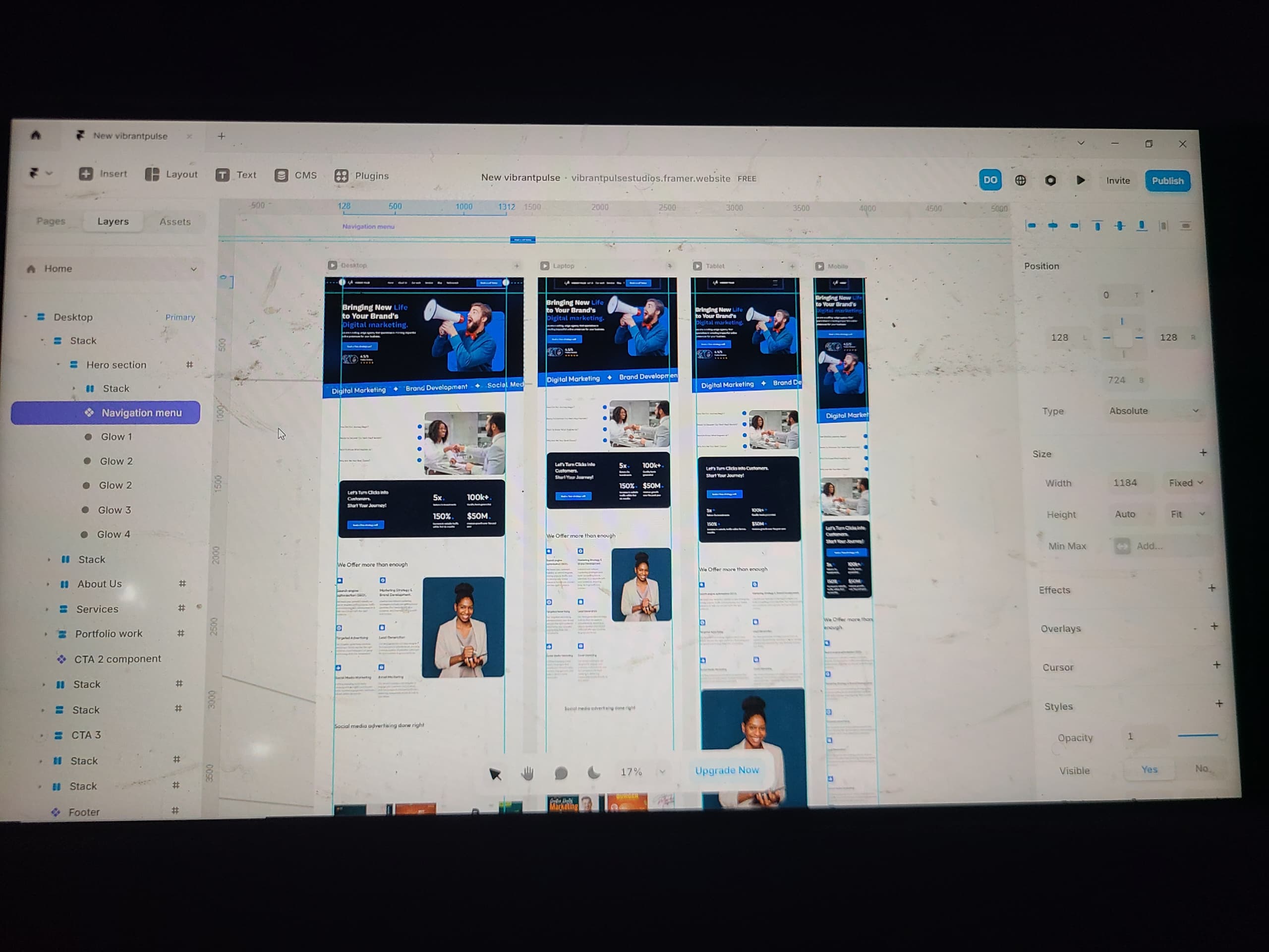
Implement a responsive design
Enhance User Experience and Engagement
Showcase Expertise and Client Success
Enhance site performance
Incorporate interactive elements
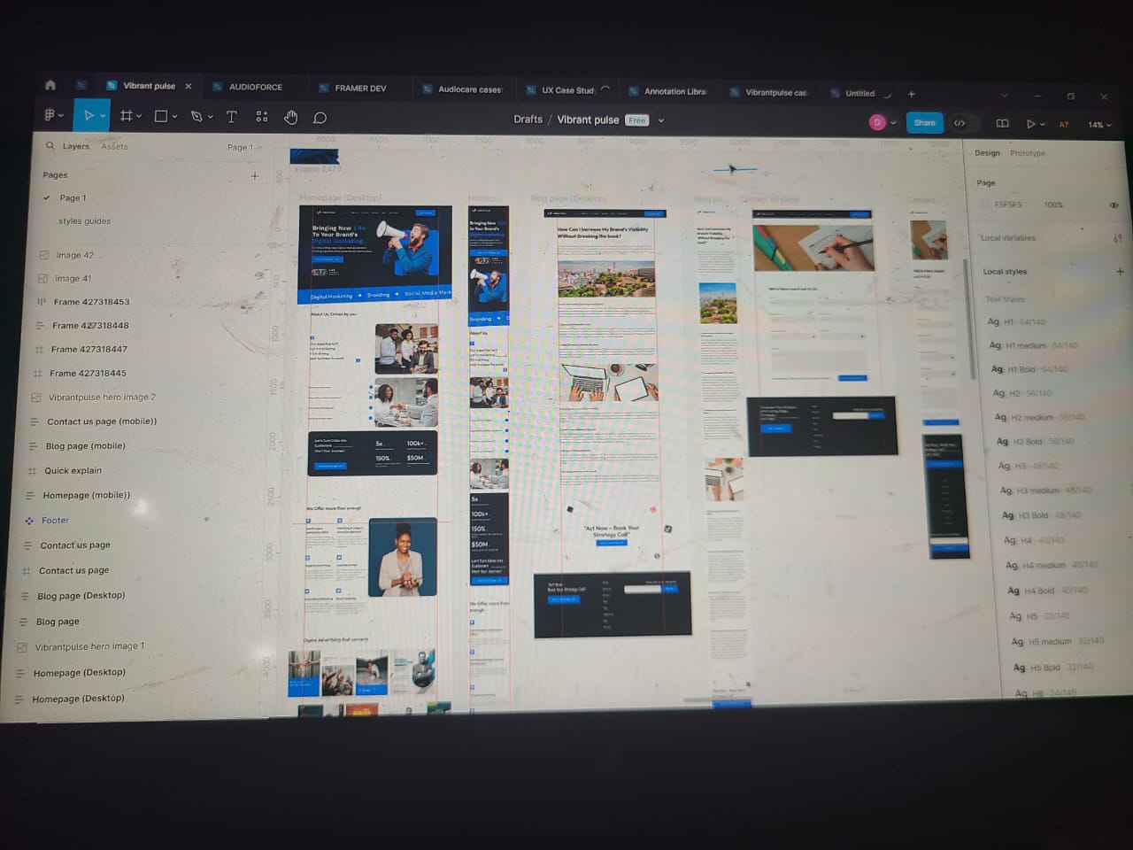
My Process
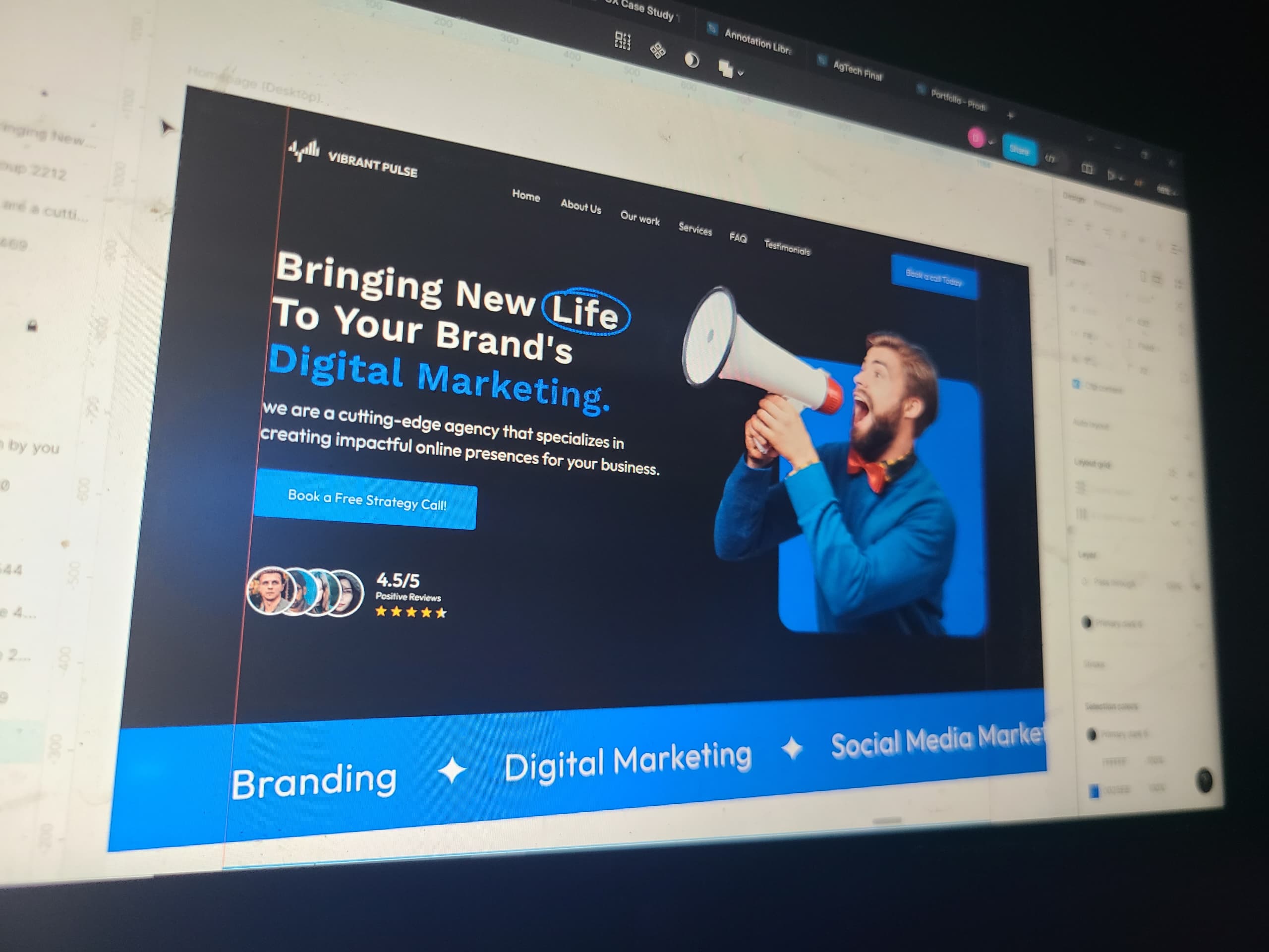
A sneak peak into what my screen look like during, design and ideation (in figma), and development (In framer).
Research and analysis
Understanding client brief


UX competitor analysis (we have got to better)
Found two to three of vibrantpulse competitors. I carried out a ux competitor analysis on key things like readability, storytelling, ease of use and user experience.
Moodboard (A pool made up of inspiration images)
This gallery is what I came up with when I went on an internet ultimate search for inspiration. Finding parts, bits and pieces that could bring the perfect solution to every page, and section.
Ideation and strategy (with a good sketches and annotations comes good ideas)
There's a lot of paper work that comes with good ideas and solution. With pen to paper I come up with multiple sketches, writings and annotations for the layout and copy. This is where the best solutions are born.
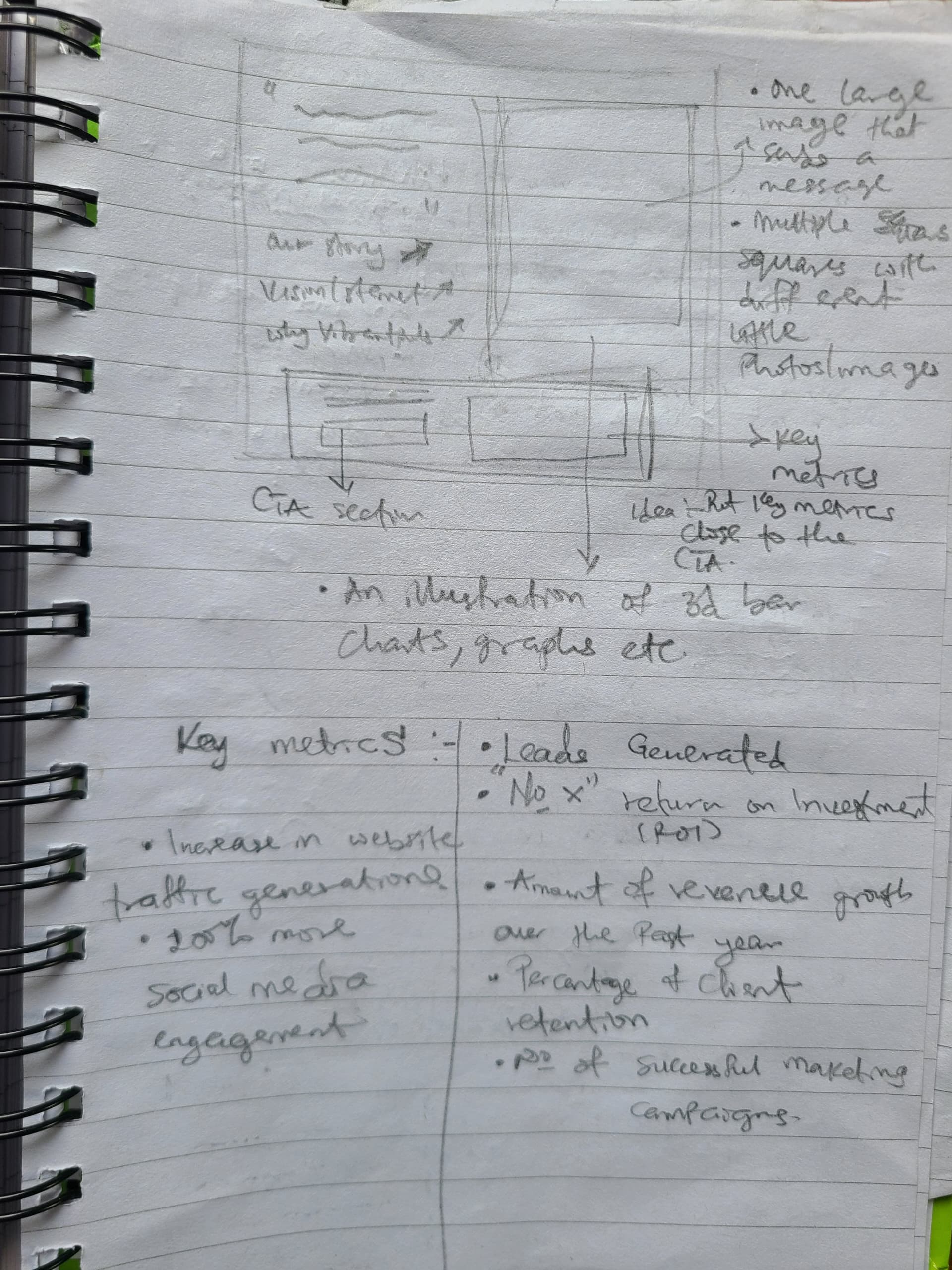
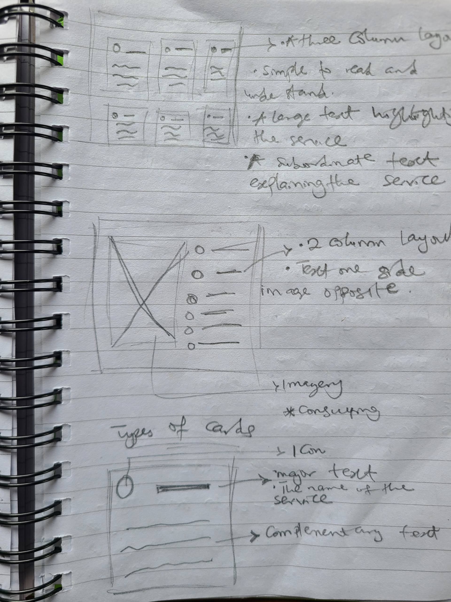
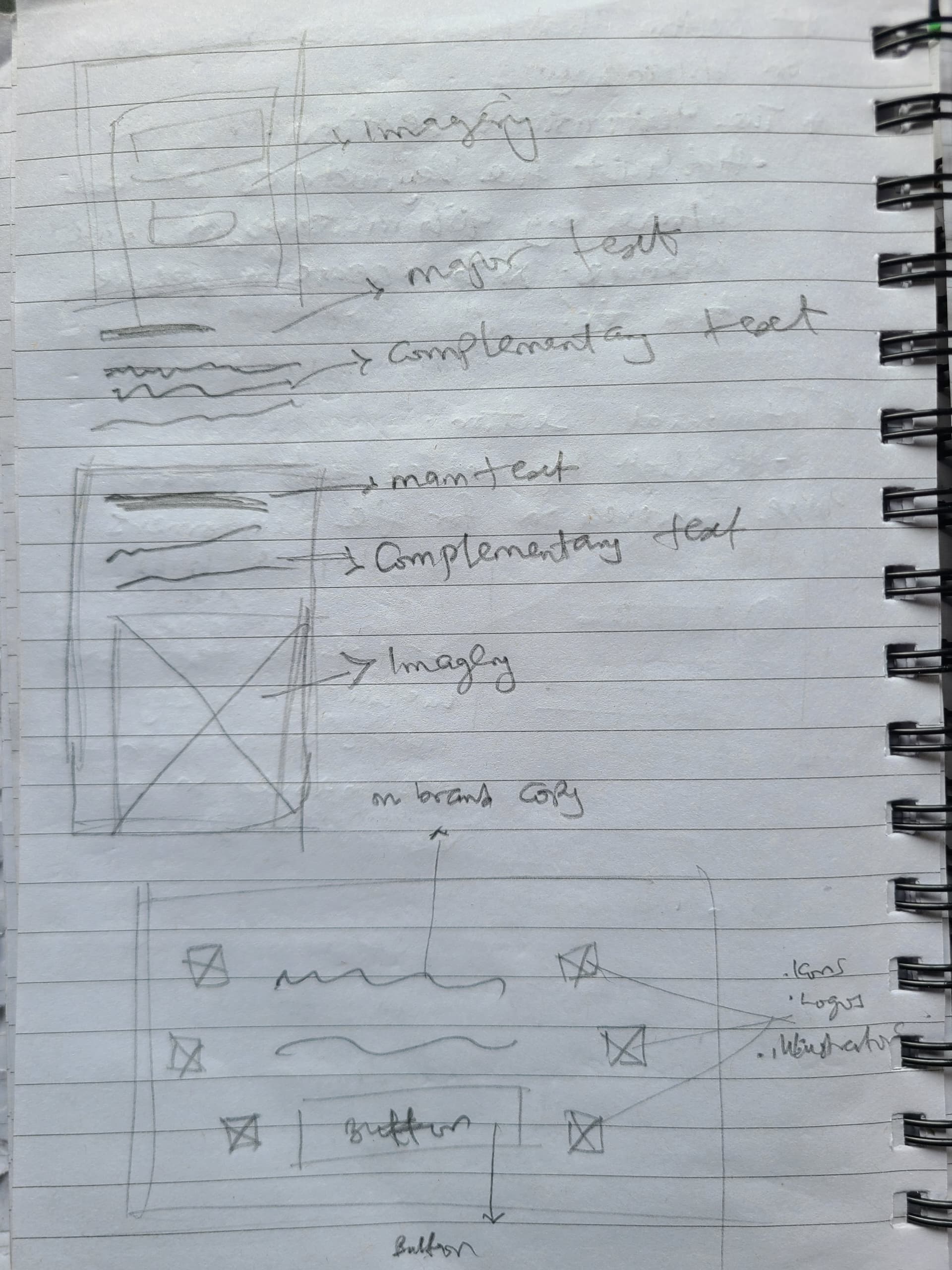
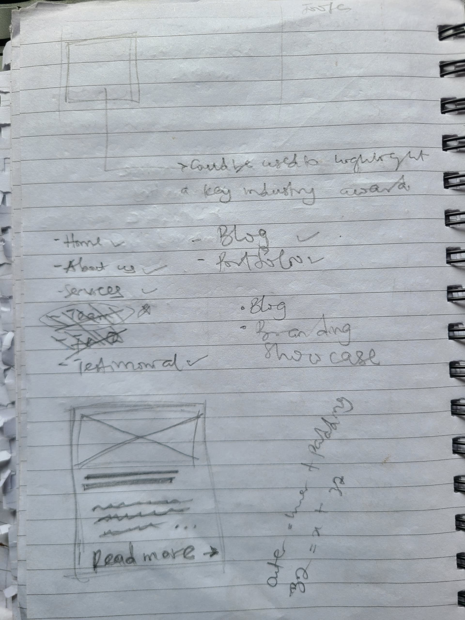

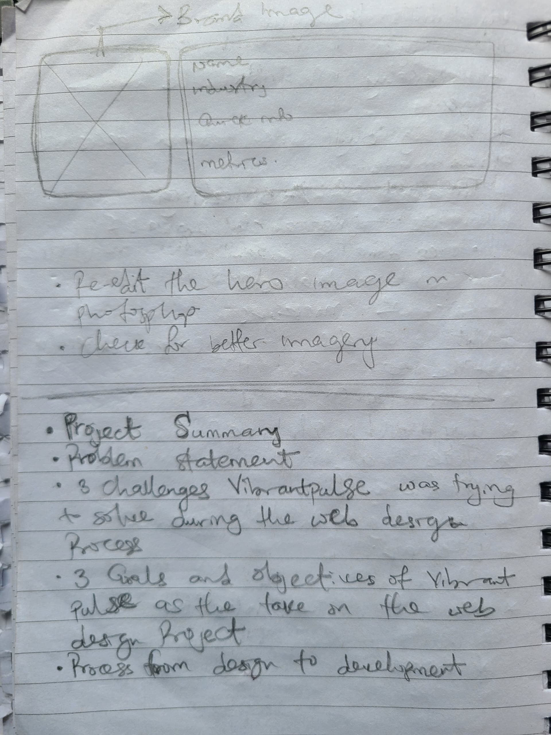
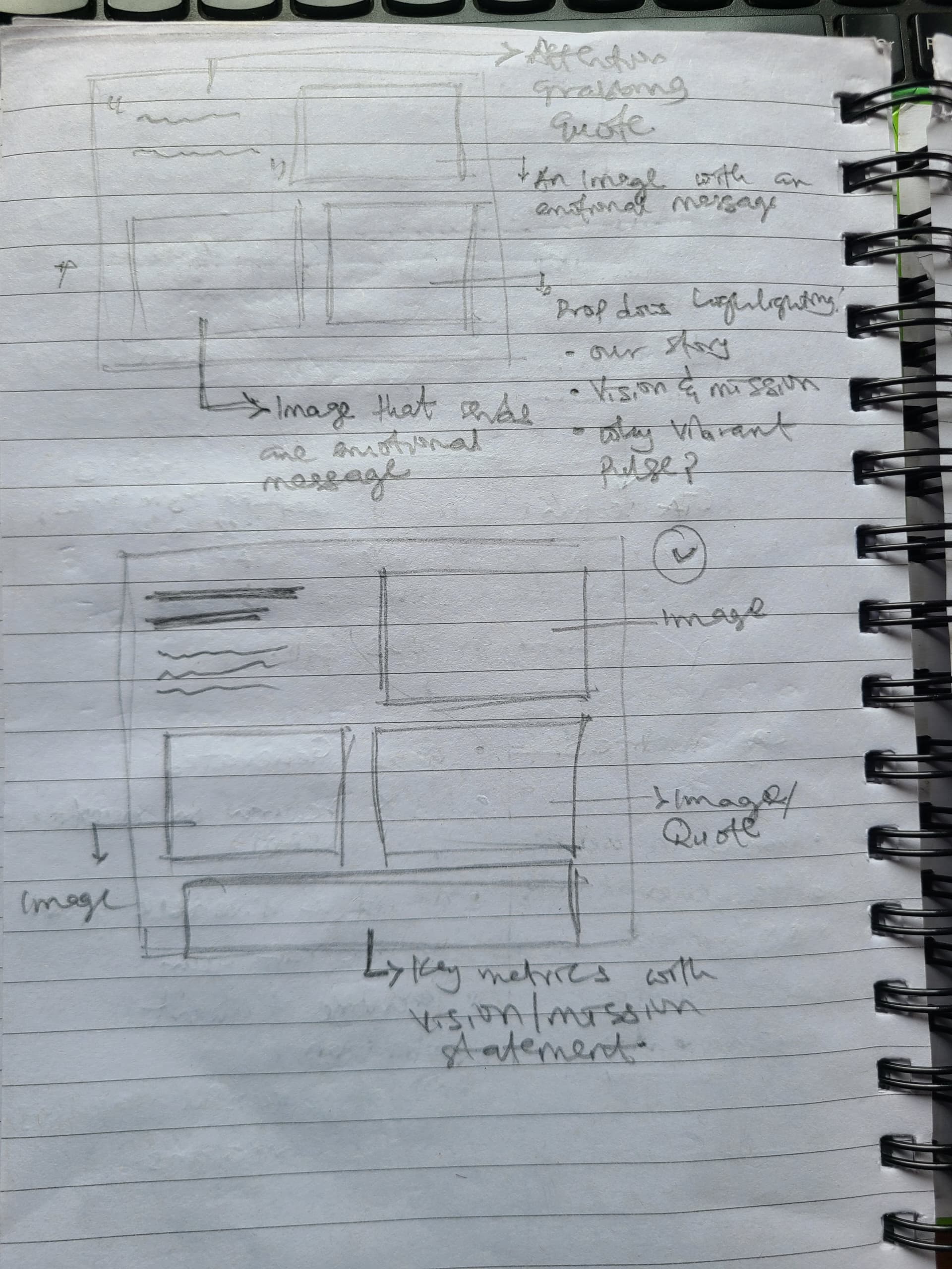
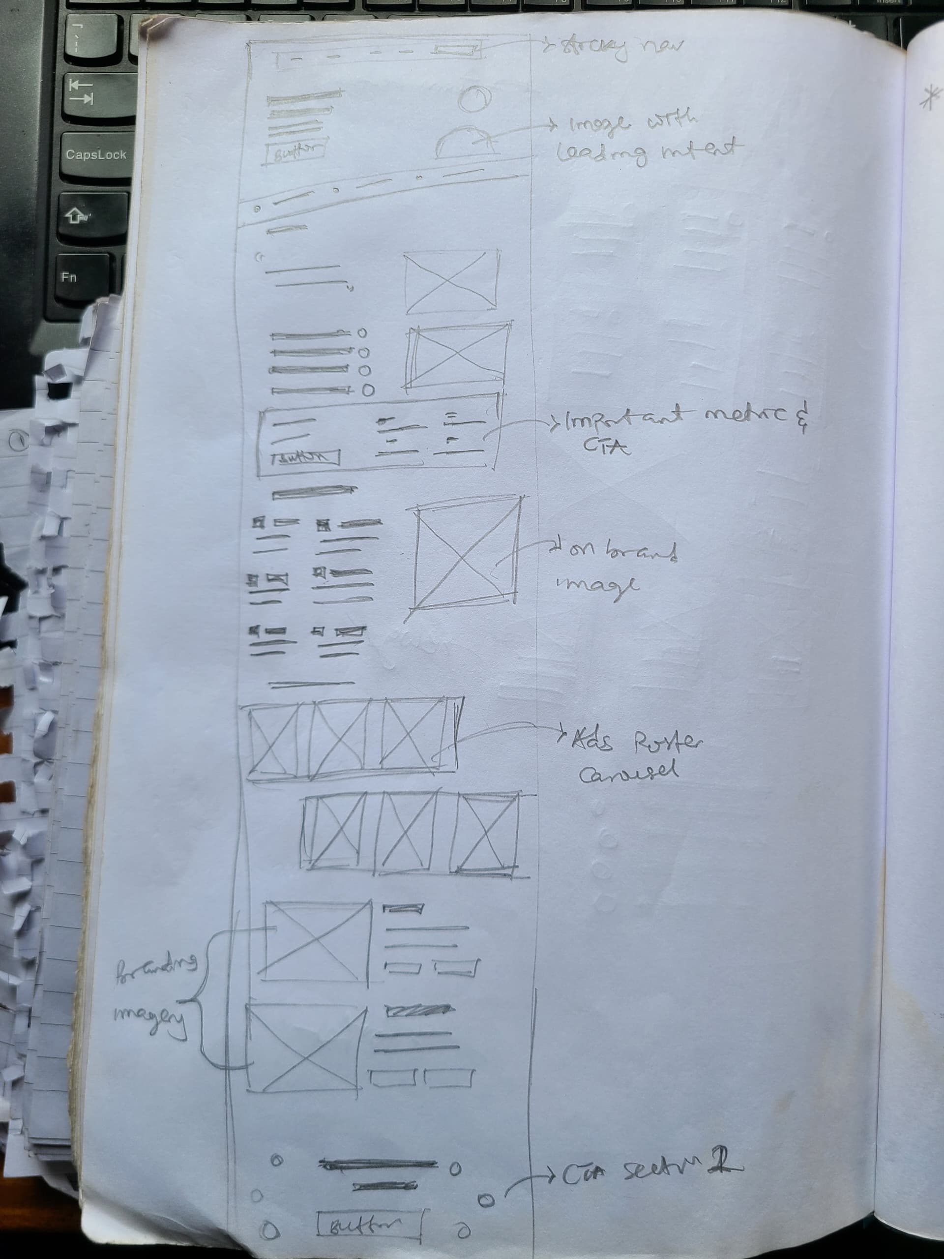
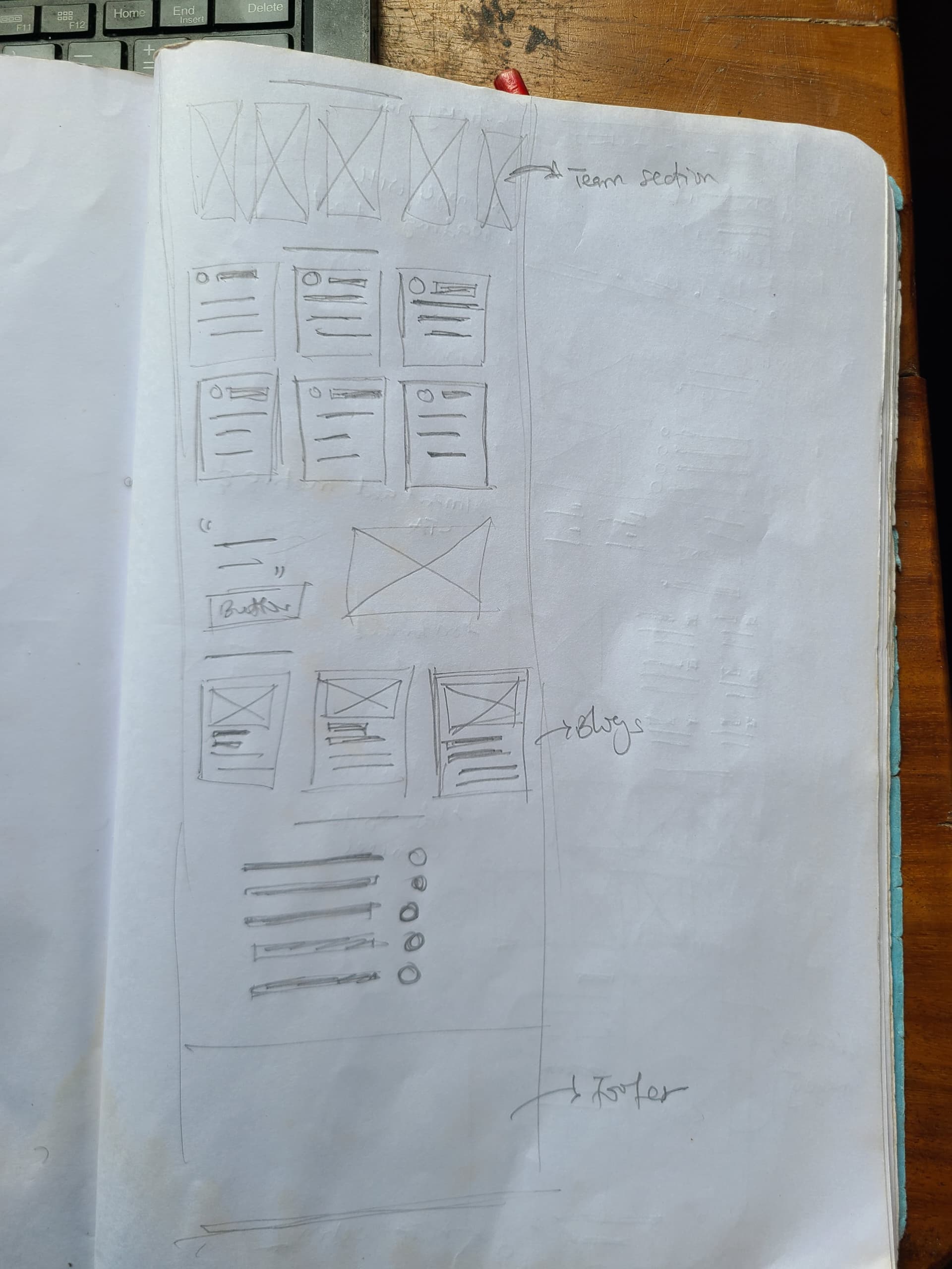
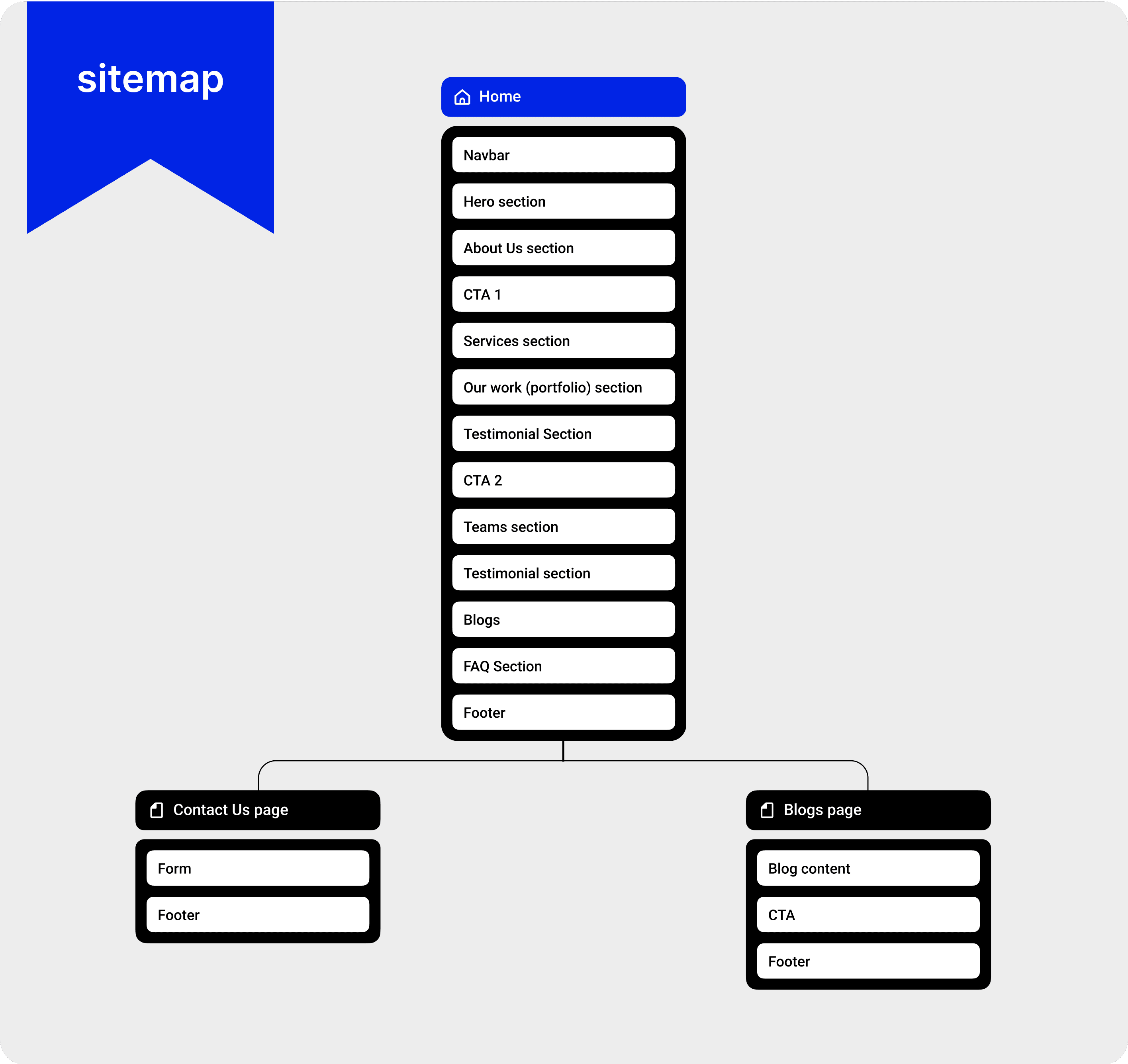
A blueprint of each section, page and how they link with each other.
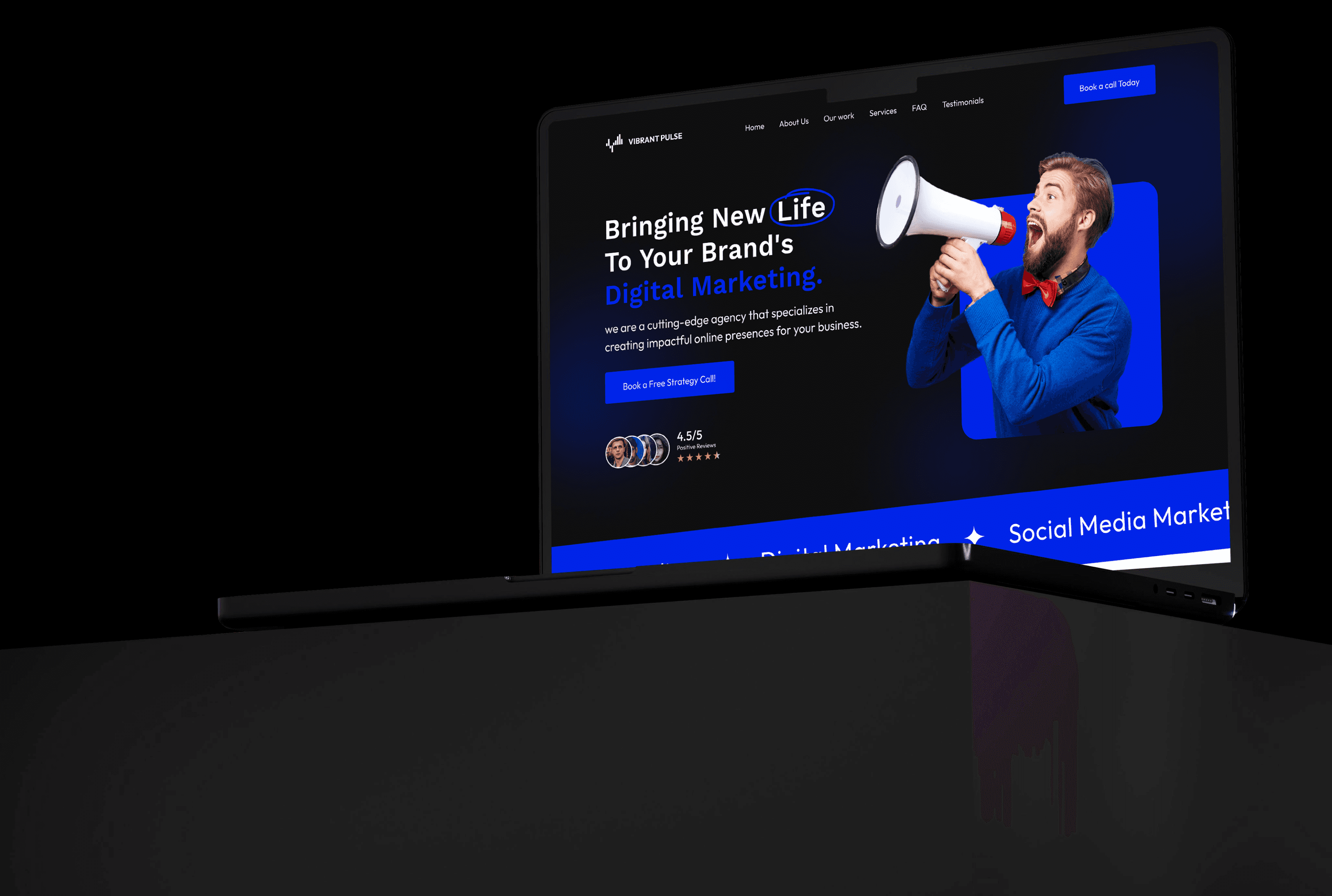
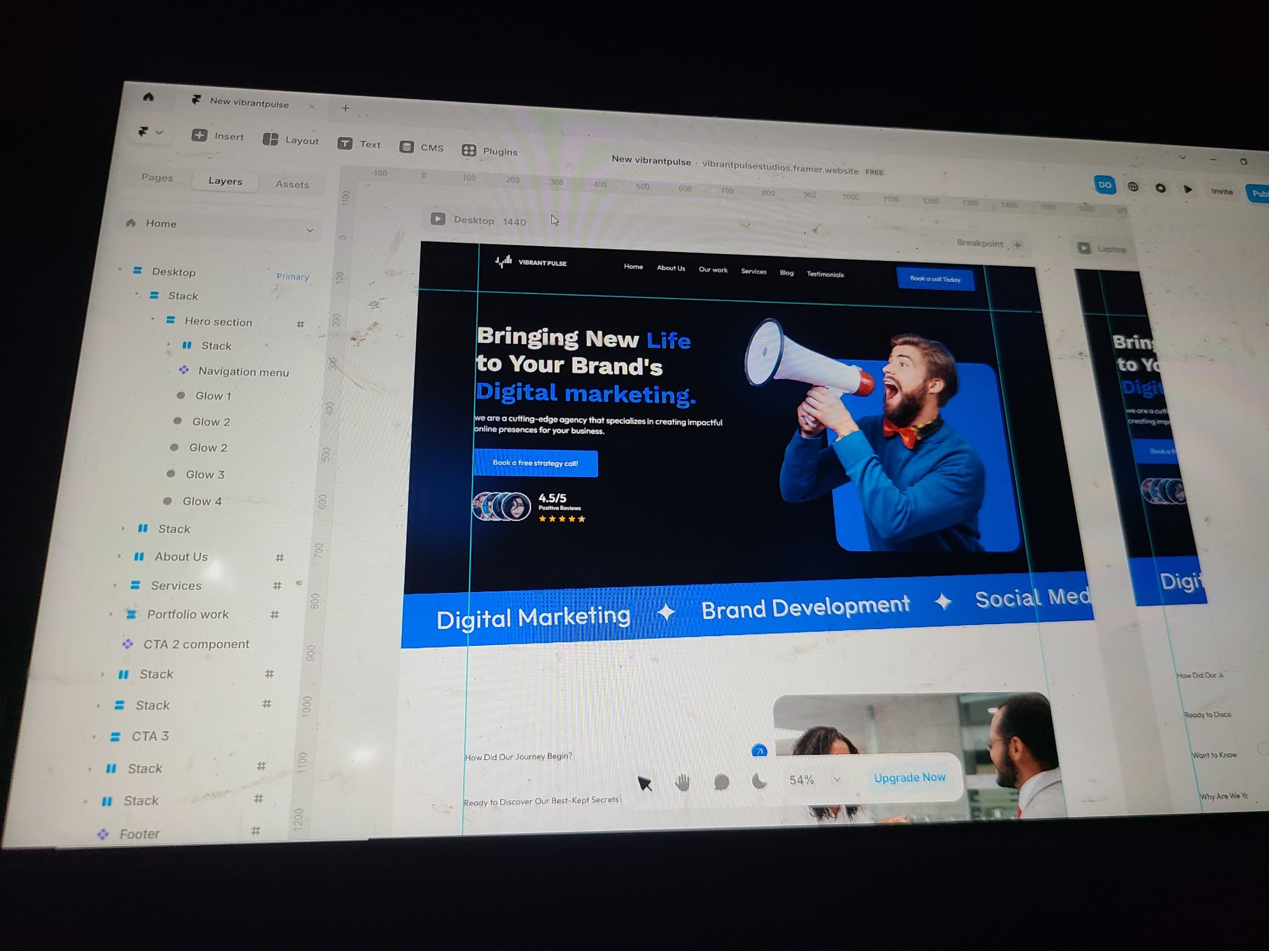
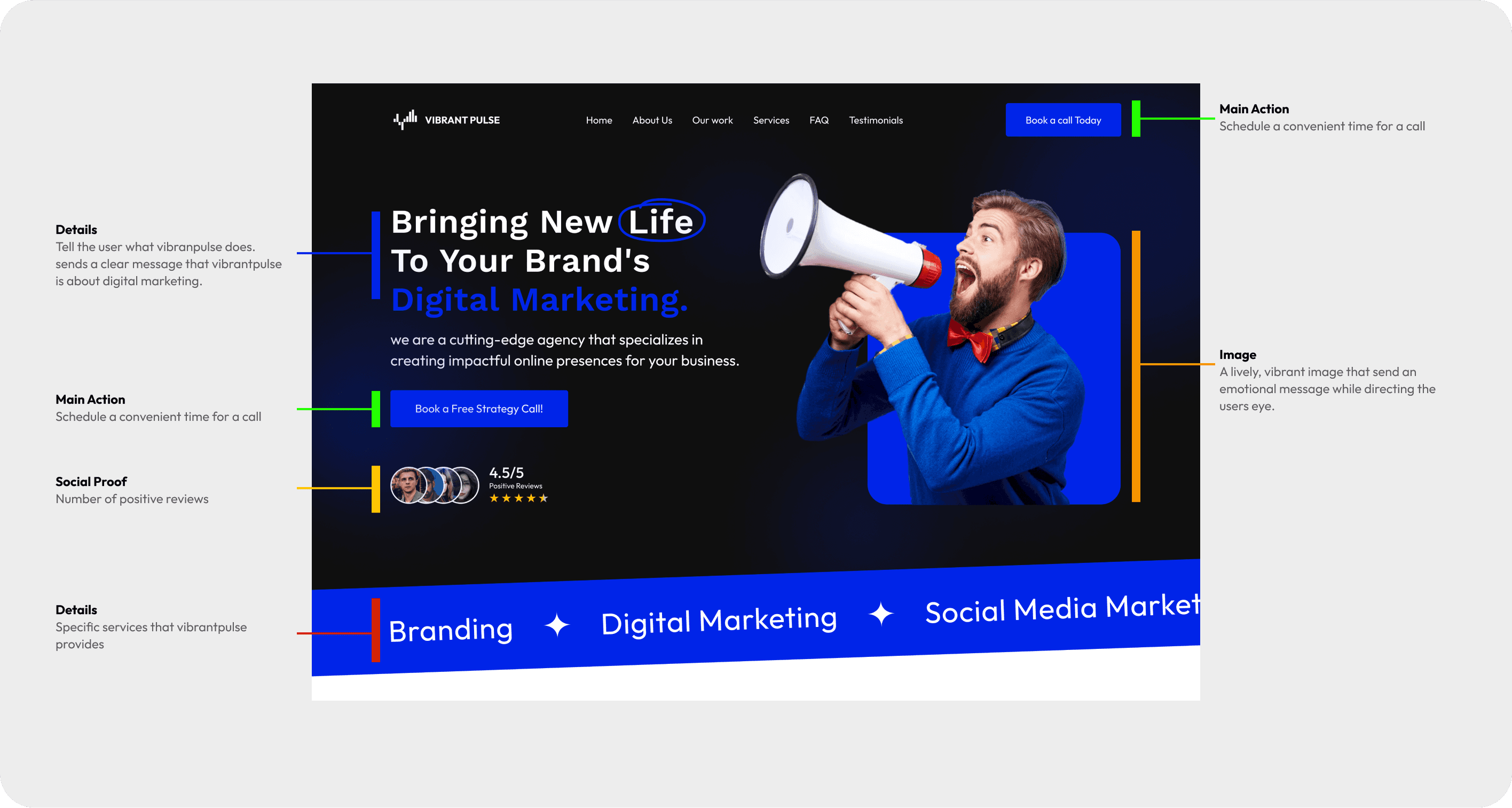
Every pixel moved with intention and purpose
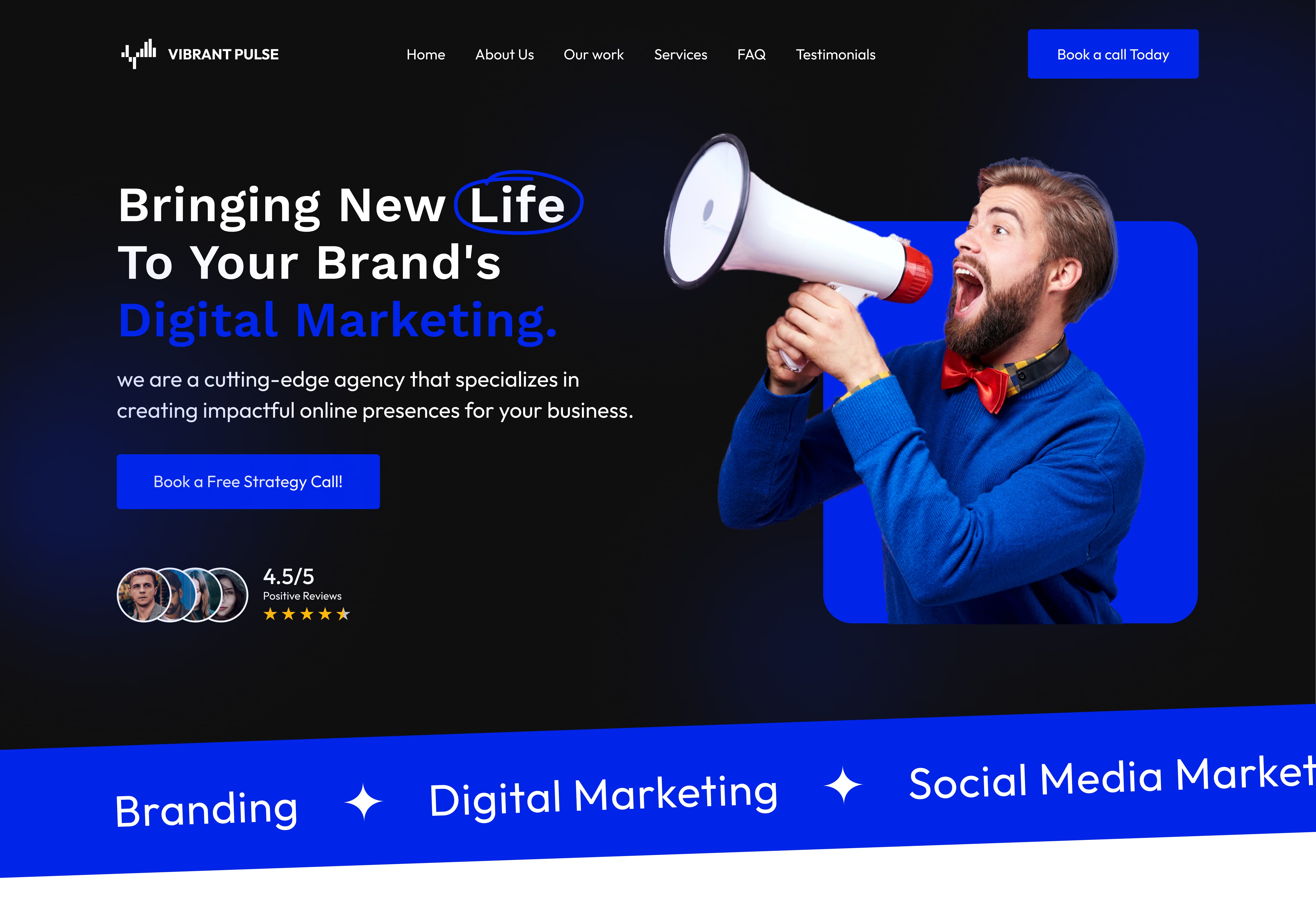
The image captures the energetic and lively brand of vibrant pulse. The buttons stand out with engaging copy that convinces the user to click. H1 text hooks the users, H2 text gives important information about the user, a social proof showing vibrant pulse credibility.
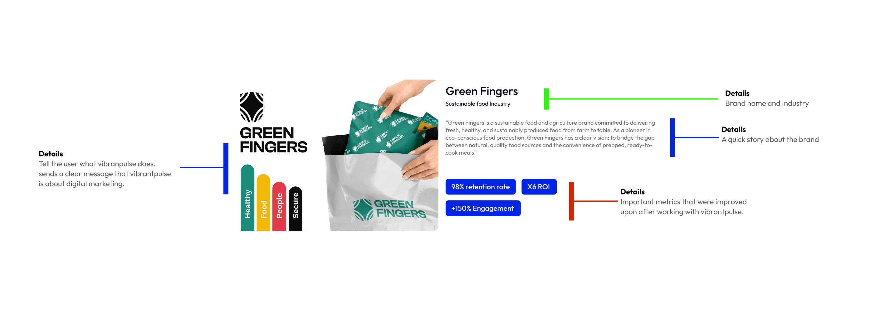
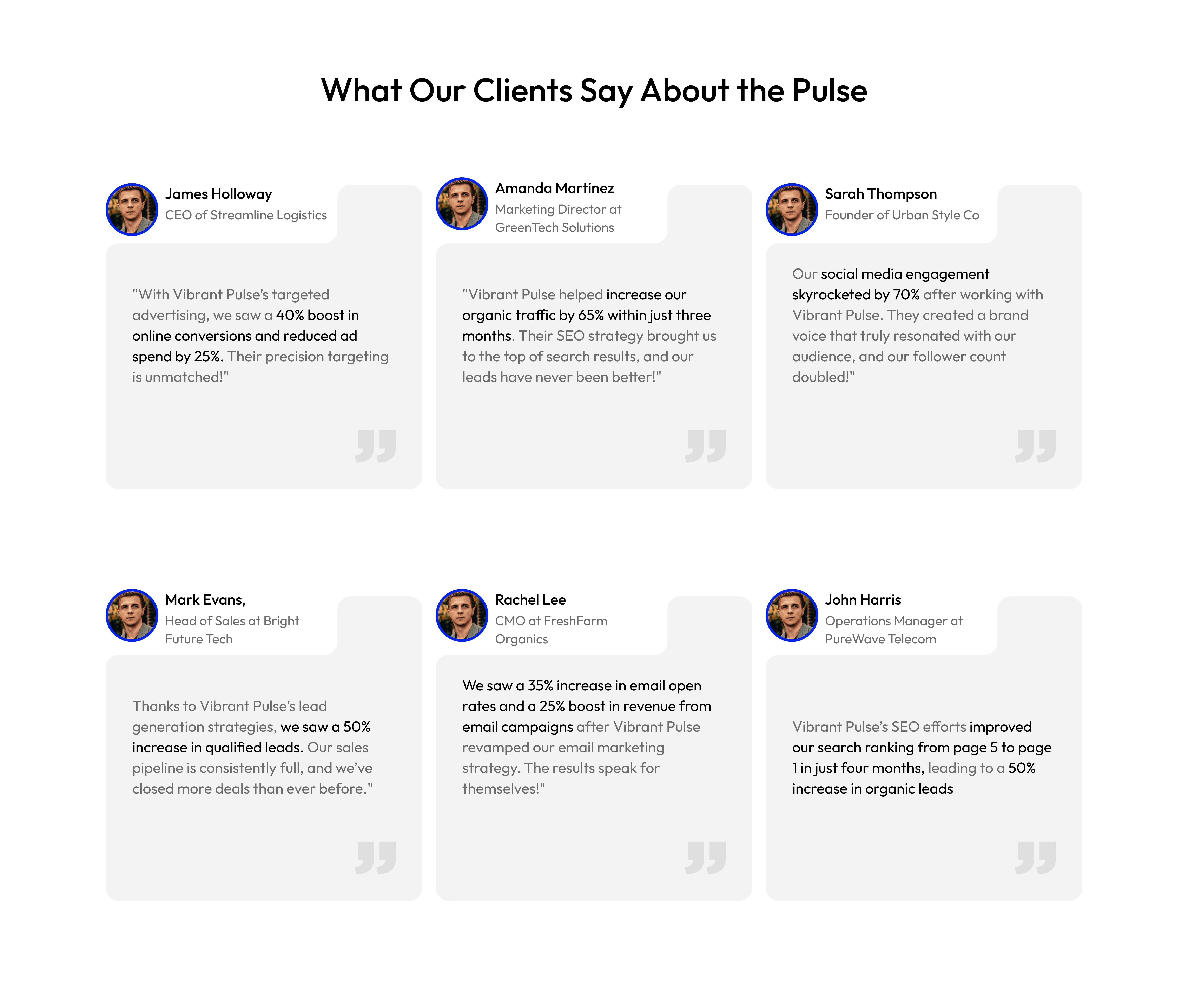
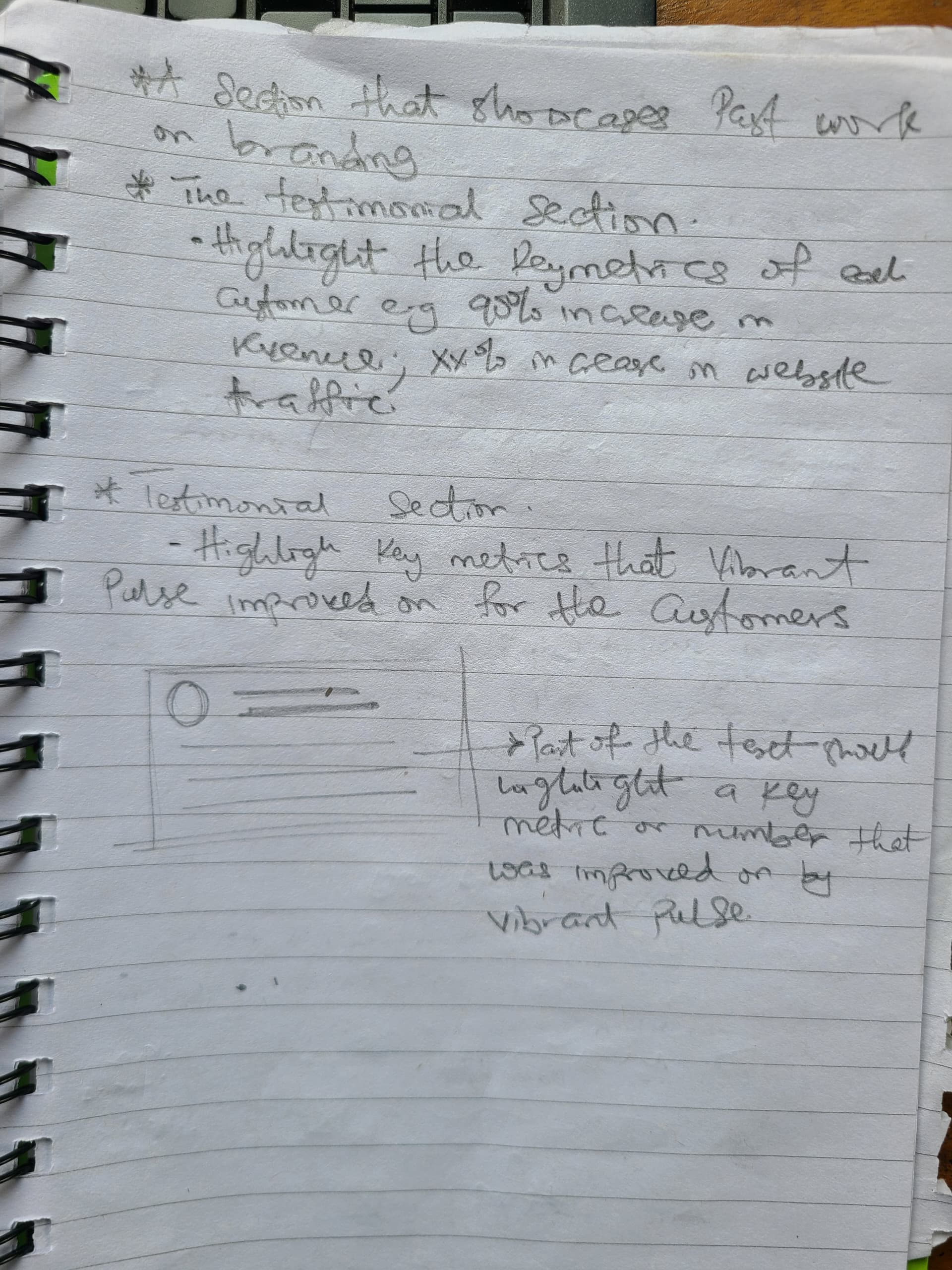
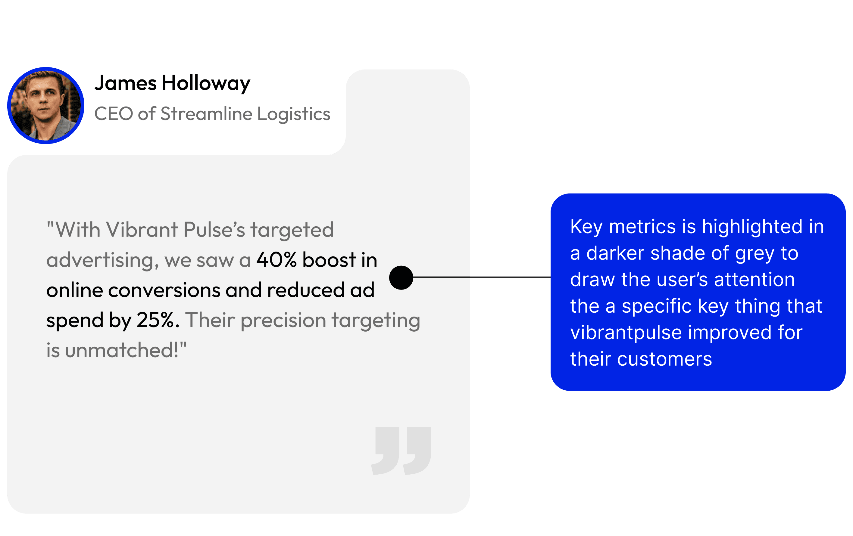
A past user has a story to tell about vibrant pulse achievements. Not everybody has the time for stories. Solution? I highlight the most important metrics that vibrant pulse improved for the user without having to read the entire story. It's quite easy to scan.
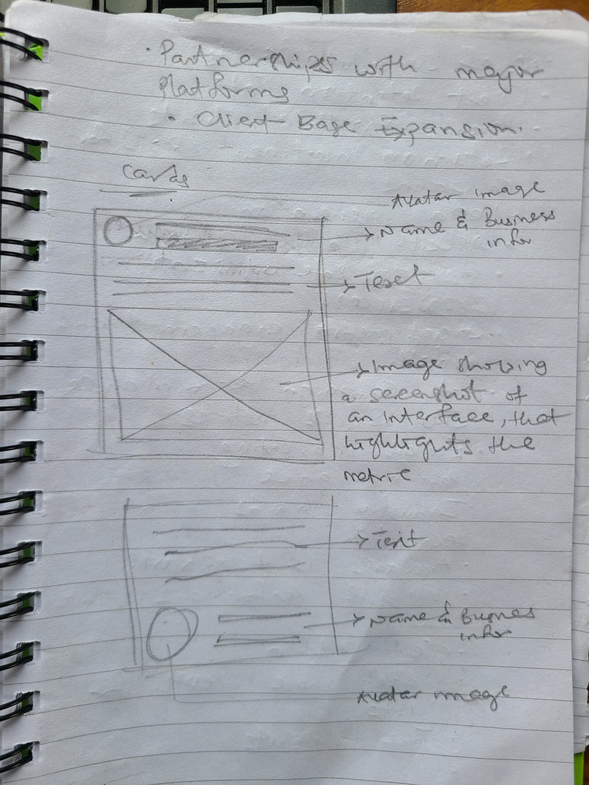
A portfolio showing vibrant pulse past work. The image sends both an informational and emotional message. key metrics are highlighted with a text telling a story of the interaction between vibrant pulse and the brand.